
Live website project. Built with AI-assisted design, content creation, and development, with human direction and review.
The project at a glance
- Website: St. Louis Water Damage Help.
- Focus: A local-service website for people dealing with flooded basements, burst pipes, sewage backups, and storm-related water damage.
- Work: Website design, service-page structure, content, and AI-assisted development.
- Approach: Make urgent actions easy to find, explain services in everyday language, and keep useful guidance close to the point of contact.
The brief: help someone who does not have time to browse
A water-damage website has a different job from a leisurely product catalogue. Someone arriving with a wet basement may be worried about electricity, damaged belongings, or what to do before help arrives. They need to recognize their situation and find a sensible next step—not decode a menu of industry terminology.
We built the site around three questions: Can you help with this problem? What should I do now? How do I contact you? That priority runs from the homepage through individual services, FAQs, and the contact page.
Start with the problem, not the company introduction
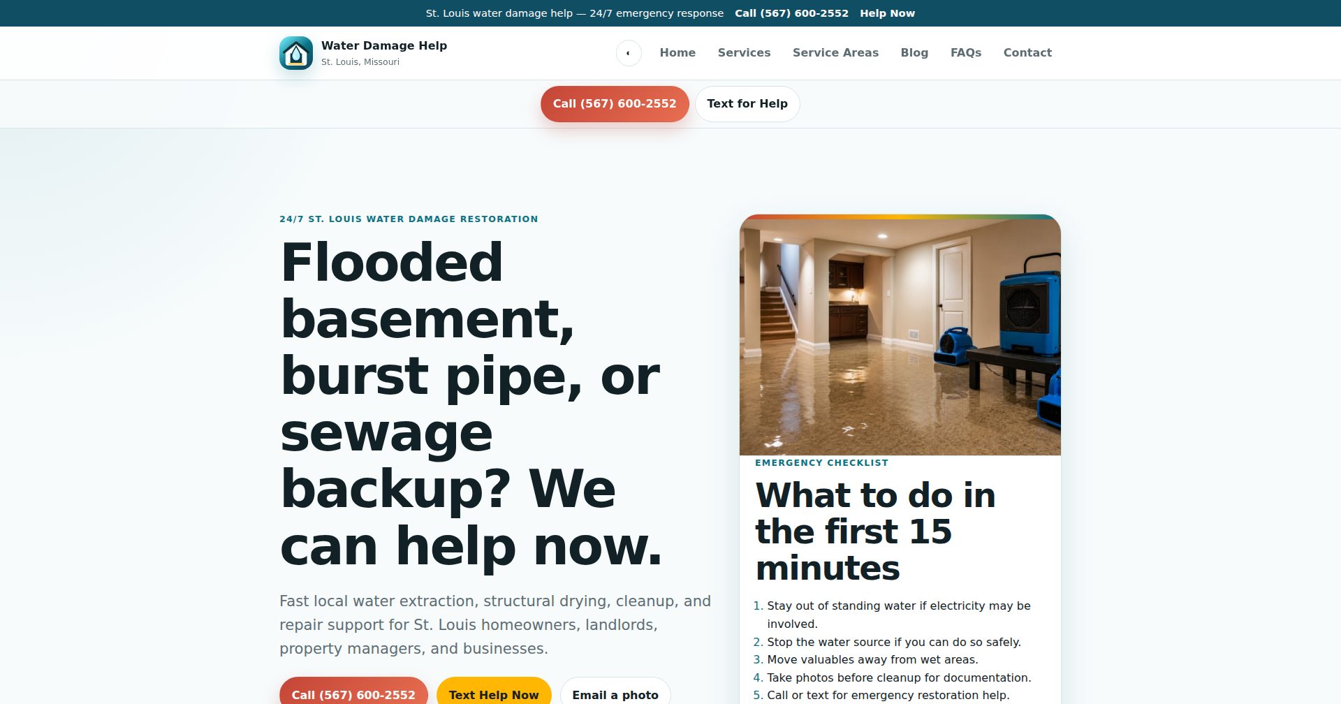
The homepage opens with familiar situations: a flooded basement, a burst pipe, or a sewage backup. It names the problem before introducing the broader restoration offer.
Call and text options appear in the header and near the main message. Email provides another route for sharing a photo. Visitors can choose a contact method without completing an account registration or navigating a long inquiry form.
The visual direction supports that hierarchy: a light background, dark oversized headings, teal accents, and contrasting call buttons. The goal is a clear distinction between information to read and actions to take—not a screen where every element competes for attention.
Put safety beside the call to action
An emergency checklist sits alongside the main introduction. Its first instruction is to stay out of standing water if electricity may be involved. Other steps cover stopping the source only when safe, moving valuables, and taking photos for documentation.
That information has a different role from a sales message. It helps a visitor pause before doing something unsafe. Service and contact pages also point people toward local emergency services when there is immediate danger.
The site explains documentation without promising insurance coverage. Its FAQs direct readers to confirm coverage, deductibles, and claim requirements with their insurer. Useful copy should clarify a decision without pretending to replace professional judgment.
Give each service a useful destination
Instead of making one broad page carry every search and every question, the site has dedicated pages for water extraction, flooded basement cleanup, sewage backups, burst-pipe dry-out, mold-prevention guidance, and storm or roof leaks.
The flooded basement page, for example, explains why visible water removal is only part of the problem. It discusses wet materials, hidden moisture, drying, and the details someone can share when calling.
This structure gives visitors a page that matches their immediate concern. Related-service links offer context, while repeated contact options mean someone who is ready to act does not have to return to the homepage.
Build local relevance through useful content
The service-area page makes the geographic focus explicit: St. Louis City, St. Louis County, and surrounding communities. Supporting content discusses locally relevant situations such as basement flooding, sump-pump failures, winter pipe damage, and stormwater intrusion.
The blog extends those topics into practical guides, while the FAQ section answers recurring questions about drying, sewage safety, and documentation. These pages give the website more depth than a collection of sales headlines.
Page titles, descriptions, and structured business and service data support a clear, understandable site structure. They are foundations for search visibility, not a promise of a particular ranking.
Made with AI, not disguised as handmade
AI assisted the design, writing, and development of this website. We used it as a production tool, with human direction and review shaping the result.
The important distinction is between generating material and deciding what belongs on a public service website. Clear navigation, accurate contact destinations, sensible safety boundaries, and readable content still matter regardless of which tools produced the first draft.
AI assistance also does not turn illustrative imagery into evidence of completed restoration jobs. The website presentation should be judged as design and communication work, not as proof of field experience or professional credentials.
The result: a live website with a clear job
The finished website connects recognizable problems to specific service information and direct contact options. Safety guidance, FAQs, and practical articles support that path rather than sitting apart from it.
The result we can point to is the live website and its content structure. This study does not claim measured increases in calls, search traffic, or revenue.
The takeaway is simple: a local-service website does not need to be complicated to be useful. It needs to understand the visitor’s situation, explain the offer clearly, and make the next step easy to find.